How to design a great real estate brochure

Brochures are an essential marketing tool, allowing you to showcase your company, services and listings in their best light. But a good brochure doesn’t happen by accident. It will require a lot of careful thought and planning. Here are some tips on how to get it right:
Understand your goals: Before you start, you need to be clear about what you want your brochure to achieve. Is it to sell your agency’s services, showcase your listings or to reinforce what you’ve said to a potential buyer or seller? What is the key message you want to achieve? And how it will be distributed – for example, online, direct marketing, a mail box drop or handed out after you’ve pitched your services? Knowing all this will influence what follows next.
Understand what you have to offer: For example, what are the key strengths and selling points of your services or the property you are selling? What makes you or your listing unique or stand out from the pack? Giving careful thought to questions like these are the first step towards building solid content for your brochure.
Understand your customer: To really engage with potential sellers and buyers, you need to understand who they are and what they are looking for. What are their needs? This will help you identify which of the advantages and strengths of your services or property to highlight and what tone to use. You need your content to connect with them. Your copy should also be written from their point of view, not from what you would like them to know. It should also show how you or your listing are the answer to what they need.
Less is better: A brochure with too much copy or photos can become confusing and is quickly forgotten. Pushing too many messages is the surest way to communicate none. No one likes to read massive blocks of text on a small sheet of paper. Besides, too many people have short attention spans in today’s fast-moving world. Get to the point and fast. Make it easier on the reader’s eyes by using headlines and bullet points. Get rid of unnecessary words and make each word count.
Pack a punch: Headlines are a great way to grab attention and get your main message across. Because many people don’t read further than a headline, yours must say something that is engaging, meaningful and memorable. Pick out the most important selling point and perhaps use that in your heading. Bullet points also help you to emphasise ideas without taking up a lot of space. Don’t embellish or exaggerate. Avoid flooding readers with too much information and try instead to give a big-picture view.
Keep it simple stupid: Go for a clean, uncluttered design. Using too many different fonts may just look messy and muddy your message. So too would using too many different colours or graphics.
Stand out from the pack: With the average person bombarded with so much marketing material these days, your brochure needs to outshine the rest with its design, photos and headings. Consider how you can make it stand out through use of different paper sizes or thicknesses or eye-catching colours or pictures. Be creative. The only limit is your imagination. The use of lots of white spaces and drop shadows can sometimes make your design really pop off the page.
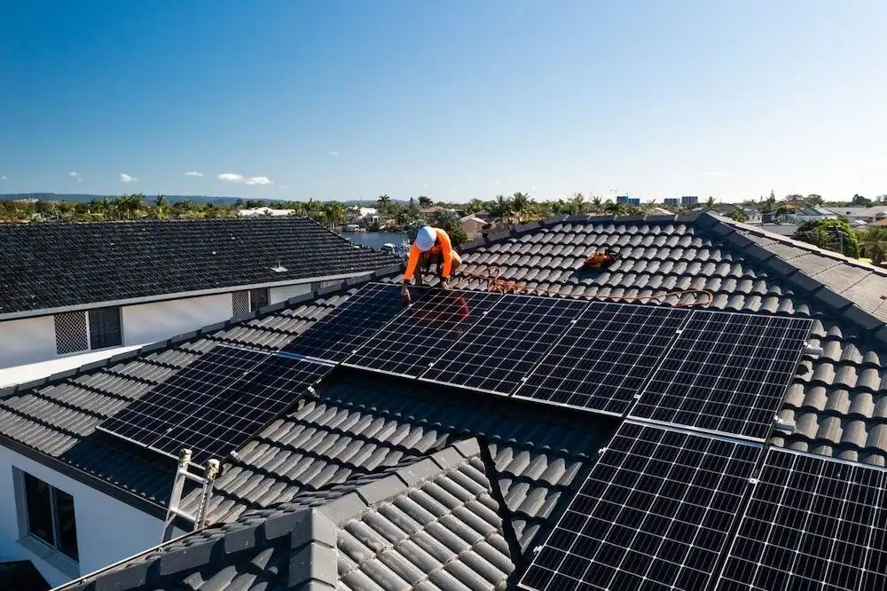
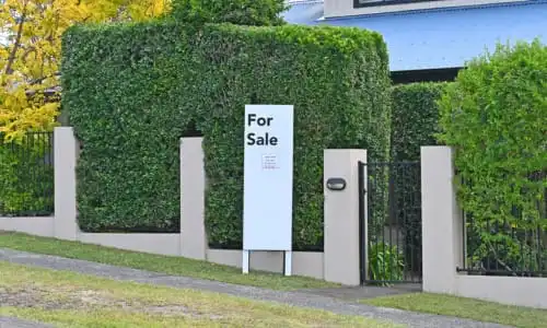
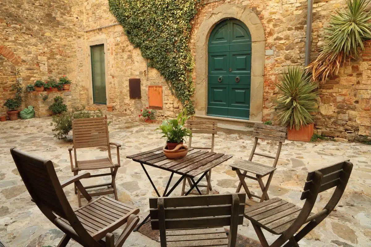
Pictures speak louder than words: Ensure the images used relate to your audience. Be cautious about cultural inconsistencies and avoid images that look too staged. Be selective in your choice of photos. Poor quality pics or too many pics of a property will lower the tone of your brochure and detract from what you are trying to sell.
Be yourself: While you are trying to stand out in a cluttered world, it’s still vital to ensure your design, graphics and copy represent you and what you are about. It’s no good having a modern, funky brochure if you yourself are more conventional in your thinking.
Make it a keeper: Put helpful or interesting information in your brochure to encourage readers to keep it, refer to it or pass it on to other people. For example, this could include vital statistics of the suburbs sell in or ranking of schools in the area.
Be consistent: Marketing isn’t about using only one medium. It’s about getting and keeping customers and it can involve a range of tools. Ensure your brochure’s design and copy is in line with your company’s other marketing and branding material otherwise you may start to confuse your customers with conflicting messages. Ensure your advertising, website, direct mail initiatives, logo, other brochures, letterheads, emails, business cards, office design and so on are consistent and that customers feel that they are dealing with the same company and getting the same message at every touch point.
Ensure your brochure is professional: Amateurish graphics and designs, poorly written copy, spelling mistakes and typos will make it harder to take you, your company or the listed property seriously. Don’t skimp on important marketing material.
Don’t forget your contact information: Because a brochure is longer than a business card, it allows you put to more than your phone number and email address on it. For example, you can add Twitter, LinkedIn and Facebook addresses too.
Have a call to action: This is what it is all about. You want to give readers that extra push to entice them towards that next step of engaging with your agency. For example, your call to action could be: “Don’t delay, give us a call today” or “Click here for more information” if it’s an online brochure.